Search Options Trading Mastery:
- Home
- Stock Chart Analysis
- Stock Market Trend Analysis
Stock Market Trend Analysis
Stock Market Trend Analysis for Options Traders
Stock market trend analysis is not a difficult skill to learn. Identifying a trend is the easy part. The real challenge lies in being able to determine whether the trend will continue or if it is about to reverse.
You've probably heard the well known expression "the trend is your friend" and so it is - as long as it is still a valid trend.
We're going to look at stock market trend analysis under the following headings:
- How and Where to Draw your Trend lines
- The Trend Within a Trend
Stock market trend analysis is critical for success as a directional options trader. Even if you are using trading strategies that don't rely on price trend prediction, you still need at least some idea of where the underlying security could go within the time frame your strategy requires.
So either way, we need to pay attention to this interesting and important tool in your trading arsenal. So let's begin ...
How and Where to Draw your Trend Lines
The simple rules for drawing trend lines are:
- For up-trends, draw your lines through the troughs.
- For down-trends, draw your lines over the peaks.
- For support and resistance areas, use horizontal lines
It is also good practice when drawing trend lines to first see if you can identify a channel pattern. This will give you some idea of the boundaries within which the security is likely to remain.
The other critical rule when drawing trend lines is, that it cannot be recognized as a valid trend unless the line touches at least 3 points. This would be three troughs in the case of an up-trend or passing over three peaks when identifying a down-trend.
The more points that it touches, the more valid the trend line is. In the case of a channel, you also need at least three points, but two of them being at one side of the channel and the third at the other.
Stock Market Trend Analysis - Up Trends
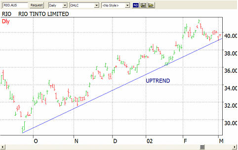
In an uptrend, the bulls are in control, driving prices to higher peaks and higher troughs. Here's how the psychology works. Buying pressure drives the price upward from its low point. Those bullish on the stock who missed the entry point wait for the first pullback, which occurs when profit takers enter the market for a short term sell off.
The bullish traders are saying to themselves "this will be a big trade, you have to get in" but on the other hand "if you delay too long you may miss out". Here the principles of greed and fear are at work.
So the bulls enter the market when it comes back enough to justify the purchase price, driving prices upward again. The price hasn't fallen back quite as low as last time but they are content with that. The result is higher highs and higher lows - an uptrend.
Below is an example of what an up trend looks like:
Stock Market Trend Analysis - Down Trends
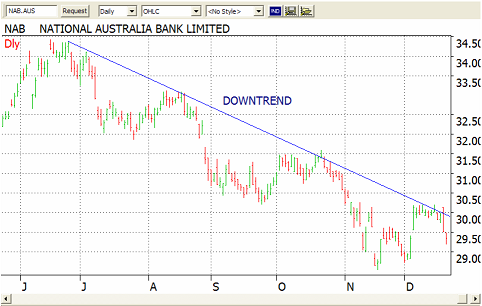
A down-trend works the opposite way. Here, the bears are in control, driving prices to lower peaks and lower troughs. Those who are bearish on the security wait for the first rally, which comes when bottom feeders enter the market.
It comes up a little and they feel the pressure to sell at a price that is less than which they would like, but fear is driving them to take what they can. So the bears come back into the market, driving prices further down.
The Line of Best Fit
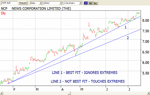
When drawing a trend line, you will sometimes need to ignore some extreme moves. You can draw the line through these extremities if it makes the best line but there will be times when it is more appropriate to run your trend lines through areas where there is the most price action.
Below, we have an example of how a line of best fit works.
Steepness of the Slope
An important feature to be aware of, is how steep the slope of a trend line is. The gradient measures how strong the current trend is. So a step up slope indicates the dominance of the bulls over the bears. You will find that steep sloping trend lines usually cannot last.
It reveals extreme emotion and trends like these are often followed by a steep reversal. In many cases, the underlying security will fall back to settle at another trend line which is not so steep.
The Trend Within the Trend
Stock market trend analysis is about identifying smaller trends within larger ones and this can be a key to big profits.
Trading in the direction of the weekly trend is like swimming with the tide. Trading against the weekly trend is like swimming against the tide. Which would you rather do?
If you first identify the weekly trend and draw your lines as per the above, then finding those short term option trades you need on a daily chart have a much higher probability of success.
Now, if you find a weekly trend that is also in harmony with the monthly trend, then you're really onto something. If the monthly, weekly and daily trends are all pointing in the same direction then the probability of the trend continuing has increased yet again.
One of the best allies I have found in identifying these types of trends is Market Club. They have a scanning service which covers the US and Canadian markets over a range of different security types, including forex pairs - and identifies securities which are strongly trending.
They call it "trade triangles" because these three important trends (monthly, weekly and daily) are all in alignment.
If you don't have access to a service such as Market Club, here are some guidelines for identifying weekly and daily trends.
For short term option traders, use a weekly chart over a period of 12 months and draw your weekly trend lines, then using a daily chart over 3 months, draw your daily trend lines. Always check your weekly trends before conducting your analysis on the daily charts.
Conflicting Trend Lines
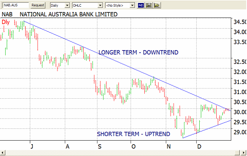
As already pointed out, trends can exist over different time frames. The chart below shows a longer term downtrend with a short term uptrend. Be aware of the intersection of trends. Usually the longer term trend will prevail but not always. Wait for confirmation before entering a position.
Don't Look Too Hard
Many times you won't always see an obvious trend. As with many stock market trend analysis patterns, they are easy to see in hindsight. As we're looking at the right hand edge of the chart, trends are sometimes hard to identify.
If you don't see an obvious trend either up or down, it's quite possible that the security is in a sideways trading range or a channel. It may even be all over the place. In such cases it might be best to just skip this one and look for other high probability trades.
There is no need to invent trades. There are plenty of real ones out there.
**************** ****************
Return to Stock Chart Analysis Contents Page
Go to Option Trading Homepage
Add a Comment
We and other readers of this information site value your input.
You can also (optionally) include any graphics such as charts, if you wish.







New! Comments
Have your say about what you just read! Leave me a comment in the box below.